Before I go into my thoughts on WW #2 I wanted to say something about color. Color is really where the artist in me comes from. I love just amazing at how color works and am always experimenting with color especially on the computer.
Now you say with so much interest and experience with computer coloring for comics how come some pages of WW's #1 and #2 printed dark?
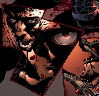
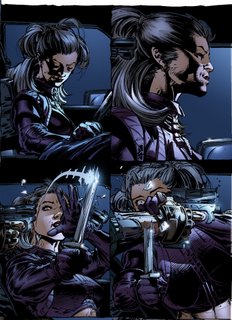
Rich Friend e-mailed me a week before the book went out, he was reviewing his advanced copies (I hadn't gotten mine yet) and informed me that the colors were dark for #2 and it was hard to see his inks. When I finally got my copies (two weeks later) I had to apologize to Rich and agree. So it was off to conferencing with Wendy the colorist and comparing our monitors with the actual printed comicbook pages. So we used that information to look at the color for #3. In #2 the blues were getting too dark and saturated (but looked fine on the monitor) and the reds were turning slightly grey and muddy. Unfortunately there were few blues in #3 to compare so final adjustment on the blues will have to wait til probably #4. #3 should be fine.
Now this may sound all kinda in exact...well it is. There are some standards in the industry and some benchmarks to check to see if colors are gonna get too dark BUT there are too many variables to be exact and precise everytime. The main culprit is the paper.
In the Image days (when money was like confetti) we got printers proofs which were one off prints of the books before the full print run was started. Therefore we could check things like if the black lines were matched with the color but more importantly to see if the colors printed anything like what they looked like on our computer monitors. Like I said the problem is paper. Paper is a finite resource and must be regulated or there soon will be no more paper. So paper quality is constantly changing. Now we may get use to a certain paper grade and the colorist has adjusted (thru months and months of comparing their files to the printed book to adjust their colors) then all of a sudden the paper changes and we have to readjust again. Nowadays we have no idea what paper is being used to print our books. Wendy was never informed what paper WW's was gonna be printed with. Now thats not an excuse that's just a reality.
The second culprit is our monitors. Go to look at expensive Plasma TV's standing next to each other and you'll find that these thousand dollars screens none of them have the same color and black and white contrast. More so for cheap computer monitors. There are calibrating devices out there but they cost alot of money and you have to constantly recalibrate them. I know of some advertising companies that calibrate everyday. Comics, let alone freelance colorist working out of their homes cannot afford that. So what do they do? They adjust...Alex Sinclair is so use to his bad monitor that he can look at it and it looks dark and muddy but he knows thats just his monitor and the book should print fine. But then again every now and then he gets a book and it doesn't do what he expected and its because a new paper was used.
Anyways, so what we are left with is like the old X-Men days where we do the best we can and then when the book goes to print we compare and adjust for the next issue and then compare that printed issue with how we adjusted and adjust again. Meaning it is a long and non-exact business.
Now to complicate matters more there's this thing of me loving to experiment with computer coloring. I was part of the three musketeers (Brian Haberlin, Alex Sinclair) that figured out how to use Photoshop to color comics. I am also a painter having been trained by Joe Chiodo. So I am constantly adjusting the way we color comics now to reach that as yet unattainable goal of replicating the painting technique in comcs. Nowadays it can be achieved (I mean the painting look) but not yet in such a standard that you can teach it to any new aspiring colorist and have them do it consistently day in and day out.
Now painting means giving the illusion of 3-dimensional form. To do that you must use a mix of saturated color to form the deep sides of an object, then you need color with little white added to it to give the illusion that the tops of objects are in your face. Unfortunately when you add white (or black) to a saturated color it starts to deaden the color and it gets flat. Primarily comics are colored using these flat colors, because they are so light that they allow the black ink lines to show, but because they are flat the overall effect is a flat object. I have found that the bigger the contrast between colors in an object the better the illusion of 3D form. Meaning if there is a big difference between the darkest color and the lightest color the more the overall realness of a drawing is. Unfortunately again the saturated colors needed for that contrast tend to be dark and cover up the ink lines that alot of people want to see. So it is a balancing act to say the least and the only way to test it, to perfect it is in the final print.

So yes it is ultimately my fault for all the pages that printed dark because I dictate the direction artistically this book goes. We are on this end trying everyday we can to adjust and adjust so that one day you'll all see exactly what I am seeing in my head art-wise...

10 comments:
Where there some post inks thrown on the book at a later time, too? Some of the inks in specific areas didn't seem to match the rest of the page.
This book started as a mature readers book and was only this year re-assigned as a code book...so alot of stuff that was okay for mature readers had to be blacked out or reshot...so far I've only done one redraw...
I love this blog Whilce, every post is like an education in comic book creation, thanks again for taking the time. Any chance of a picture of the Portacio Studio? Do you work from home or the Wildstorm studio?
As I said before, when computer colouring came in it was really vivid and noticable especially in a book like wetworks where you were working with metallic colours.
What are your views on going back and computer colouring older books? Would you like to see your original Wetworks series re-coulourd? Have you experimented with that?
I wonder what your Uncanny work would look like or Jim's record breaking X-Men no 1 would be like, computer coloured?
wow! you have a blog?!!. . wow. . .you're one of the reasons i started reading comics when i was a kid!!!. . . .wow. . . greatness!!. . . . wow. . .the end.
vjiahHey Whilce!
Do you use one regular printer? Or is the book printed in different places depending on circumstances?
Couldn't you get a color profile from a printers press (assuming you run digitally) and apply that consistently to a set of monitors that you all work on? I know different monitors would handle colour different but if you all upgraded to the same set-up wouldn't colour management be easier?
How do you deal with not getting a proof of the artwork back? I work in Advertising and I insist on a printers proof for all jobs? Do you go down and check it at the press??
Must be a little scary to just let it dissapear into the void and then wait and see what comes back!
Whilce, would you have preferred to keep the mature reader content and themes?
Russ
Russ,
It would be nice to recolor back issues and use the FX we now have these days to enhance things. Back then we were only learning about the bounderies of computer color. It won't get done because of the cost but it would be cool...
Will have some pix up soon of my studio. I have a self contained studio at home now. It's great I can play my guitar, draw, and play Ghost Recon at four in the morning and know one can hear me...
Dances...
Yeah it's scary...I'm really not sure what's up nowadays. I know in Wildstorm we have a laser color printer but it was never ever calibrated correctly. To tell you the truth money is what pushes anything and there just isn't enough money in comics to do things like calibration...
Russ,
Yeah I lament the changing to code. Wetworks is meant to be a visceral book.
The scene of Red in the hotel with that business guy was meant to show how low Red had fallen and therefore all the incentive Dane needs to convince her to his side. As it reads now she flirted with business man for corporate espianoge. The original script and page she is not just flirting and kissing the guy, she is "servicing" the guy to get what info she needs. This is why in the next scene she rages at Dane for daring to know about how low she has come. So with the Mature readers label it allows you to really go at emotions and motivations...
Any possible chance of the trade edition of this book being more of a director's cut with the Mature Readers edits thrown back into the material?
Probably not, but it doesn't hurt to ask. Seeing some of the covers and whatnot over on the Gelatometti site inked by Rich, the original versions seem to flow better.
Post a Comment