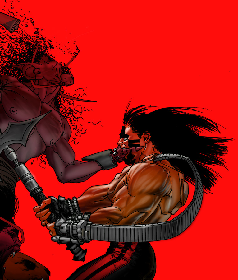
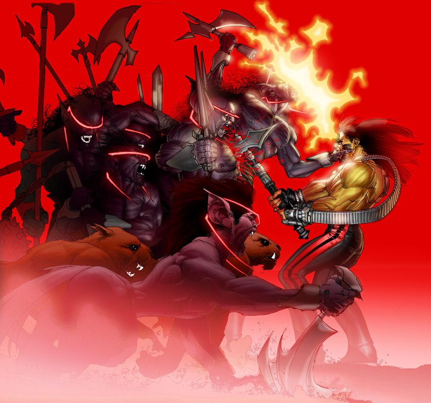
Here is the full sized version of the cover and a cropped portion of the cover before FX and final lighting...
This and some of the other covers you will see are cropped ever so tightly. That is because way back when, we were gonna do something the studio called "widescreen covers" where there would be blocks of color along the top and bottom of the comic book and the image layed in between the blocks of color. So as you see this cover is basically a square, as opposed to the usual "tall" rectangle covers are usually drawn with. They scapped that idea a long time ago (tho' after I drew the covers)so my covers were then cropped to fit on a regular tall rectangular cover...
Another bit 'o trivia, the cover to WW's #1 is a regular proportioned cover because it was originally drawn as a promo piece. Editorial liked it so much they rallied for it to be the cover to #1...
11 comments:
I was wondering about that.
Shame, because the full picture is really much nicer.
I think you should fight to get the widescreen covers back, at least for a little while.
I think it might help WildStorm's books stand out on the shelf, if they had a uniform design like the Ultimate Marvel books.
Oh man this brings back old memories. I reall loved the original wetworks comics. I'm glad I found your blog whilce.
Its a stunning cover Whilce, the colours are like nothing I have ever seen before, truely striking.
amazing as usual, nice colors and effects whilce
do you think the dane/beuller relationship is similar to how lex luthor looks towards superman, an alien intruder bring his enemies with him and making them earth's enemies?
i also wouldn't mind the widwscreen covers format of the interlinking covers epecially if they look as grat as this one
I just read the first two issues of the new Wetworks, and they were great! I loved the original series - especially the first 10 issues or so. I'm glad to have this interesting blend of action/sci fi/horror back with a new story and even some new characters. Keep up the great work! I look forward to more in this world within a world.
Rich Friend is posting some of his inks over at the Gelatometti blog, with scans taken off the original art boards, if anyone's interested.
gelatometti2.blogspot.com
Hello Whilce, I was curious to know if the pills that Red takes allow her to survive in the sun light or control her blood cravings?
Thanks
Wow, that is amazing. i have a new desktop image. It kind of makes me sad to think that there is the rest of that amazing image that I maynot have seen otherwise.
Thanks for posting it.
If only there was a nice collection of the WetWorks cover pieces you've done. The original WW # 1 was spectacular, WW # 3 had an image of Grail that is by far one of my most favorite comic covers to date, and there were several other really pretty illustrations throughout the series.
I'm so glad this book is back. :D
This looks awesome!!!! Really good to see wetworks again, Whilce!
Post a Comment